Image source: Dreamstime Stock Photos
“Premium” isn’t just a price tag. It’s a feeling a customer gets in the first few seconds of seeing your product. Before they read your description, before they compare ingredients, before they check reviews, they’re already deciding about quality based on what they see. In ecommerce, photography is your packaging, your shelf display, and your first impression all at once. If your photos feel premium, your product feels premium. If your photos feel casual or inconsistent, even a great product can look cheaper than it is.
The good news is that “premium” is not a mystery. It’s a combination of controlled light, clean composition, intentional styling, accurate color, and consistent presentation. You don’t need a massive studio or luxury camera to get there. You need repeatable habits that remove amateur signals and replace them with polish.
Here are photography tips that reliably make ecommerce products look more premium, whether you’re shooting in a home setup, a small studio, or a rented space.
Prioritize Clean, Soft Light Over “More Light”
Harsh light is one of the fastest ways to make a product look inexpensive. It creates hard shadows, blown highlights, and uneven color. Premium visuals usually feature soft, directional light that reveals texture without exaggerating flaws.
A simple premium-light setup:
Shoot near a large window with indirect light (not direct sun)
Turn off overhead bulbs to avoid mixed color casts
Place the product about 45 degrees to the window so you get gentle shadow shape
Use a white foam board opposite the window to bounce light and soften shadows
Soft light creates smooth transitions and a sense of refinement. It also reduces the need for heavy editing, which helps the product feel more authentic.
If you use artificial light, diffuse it. A softbox or even a white sheet can help. The goal is not brightness. The goal is controlled softness.
Use One Consistent Background That Looks Intentional
Premium product photography often looks “simple,” but that simplicity is carefully designed. A messy background or inconsistent surfaces instantly make a product feel like it was photographed casually.
Choose a background style and stick to it:
Pure white for a clean marketplace-ready look
Light neutral (cream, pale gray) for modern editorial vibes
Dark neutral (charcoal, deep gray) for luxury mood
Textured minimal (linen, light wood, stone) for lifestyle premium
The key is consistency. If one product is on a white backdrop and another is on a patterned countertop and another is in a dim room, your brand starts to feel scattered. Premium brands feel cohesive.
If your theme is minimal, keep textures subtle. Small texture adds warmth without looking cluttered.
Master Reflections and Shine
Many products look “cheap” in photos because of uncontrolled reflections. Glossy packaging, glass bottles, metal surfaces, and shiny plastics reflect everything: windows, cameras, your hands, and the room itself.
Premium photography controls reflections by controlling the environment.
Quick reflection fixes:
Use larger diffused light sources (bigger light equals softer reflections)
Shoot slightly off-angle to avoid direct reflections into the lens
Use black or white cards to shape reflections intentionally (black adds definition, white softens)
Clean the product thoroughly before shooting (fingerprints are conversion killers)
Reflections can look elegant when they are controlled. They look sloppy when they are accidental.
Shoot Like a Product Catalog: Consistent Angles and Scale
Premium brands don’t reinvent their angles every time. They create a repeatable visual system. This makes the store feel curated and easier to shop.
Create a standard shot list for each product:
Front hero image
45-degree angle (adds dimension)
Side/back view if relevant
Top-down if relevant (especially for flat products)
Detail close-ups (labels, texture, craftsmanship, ingredients)
Scale reference (in hand, next to a common object, or on a model if wearable)
Lifestyle usage image (in context)
Consistency does two things: it increases trust and it reduces cognitive load. When customers can compare products easily, they feel more confident buying. Confidence is premium.
Use Depth and Shadows to Add Dimension
Flat images often feel cheaper because they lack shape. Premium imagery tends to include subtle depth cues: gentle shadows, controlled falloff, and dimensional lighting that makes the product feel tangible.
To add premium dimension:
Avoid front-on flat lighting as your only approach
Use side lighting to create shape
Let a soft shadow exist rather than trying to eliminate all shadows
Use a slightly darker background with lighter highlights for a luxury look
Shadows are not mistakes. Uncontrolled shadows are mistakes. Controlled shadows add realism and sophistication.
Style With Restraint: Fewer Props, Better Props
Props can elevate a product, but too many props make it feel like a craft project.
Premium styling is about restraint:
Choose one to three supporting elements max
Keep props relevant to the product story
Use a consistent color palette
Avoid cheap-looking props (plastic, clutter, busy patterns)
Props should support the product, not compete with it.
For example:
A skincare bottle can be paired with a clean towel, a neutral tray, or a simple plant
A coffee product can be paired with a ceramic mug, a spoon, or beans in a small dish
A tech accessory can be paired with clean desk elements like a notebook or minimalist keyboard
If you’re unsure, remove props. Premium often improves when you simplify.
Make Labels Readable Without Distorting Reality
Customers want to read what they’re buying. Premium photography balances readability with authenticity.
Tips for readable labels:
Shoot at a slight angle rather than extreme perspective
Use enough resolution and sharpness for zoom
Avoid shallow depth of field that makes key text blurry
Use controlled light to avoid glare over labels
If the label is hard to read, customers feel uncertainty. Uncertainty is not premium. Clarity is.
Edit for Realism and Consistency, Not Drama
Over-editing is a common premium killer. Heavy contrast, aggressive clarity, extreme saturation, and trendy color grading can make products look unrealistic. When products look unrealistic, customers worry about being misled.
A premium edit usually includes:
Accurate white balance (true-to-life color)
Controlled highlights (no blown whites on packaging)
Gentle contrast (definition without harshness)
Subtle sharpening (avoid halos)
Minor cleanup (dust, small distractions), but not “plastic perfection”
Consistency is the real luxury signal. Edit all product photos with the same approach so your store looks cohesive.
Match Your Photography to Your Price Point
Premium doesn’t mean the same thing for every brand. A $25 handmade candle can feel premium in a cozy, warm, textured environment. A $400 minimalist gadget might feel premium on a clean, bright, high-contrast background.
Choose a premium style that aligns with your brand:
Modern premium: clean backgrounds, crisp lighting, minimal props
Natural premium: soft light, organic textures, warm neutrals
Luxury premium: darker tones, controlled highlights, dramatic shadows, elegant spacing
When your photography matches your positioning, customers believe your price more easily.
Use Lifestyle Images That Feel Believable
Lifestyle photography can make products feel premium by showing them in a world customers want to step into. But it has to look believable.
Premium lifestyle images:
Use natural light or well-shaped artificial light
Have a clean environment (no distracting clutter)
Include human elements thoughtfully (hands, usage, context)
Feel “lived-in” without looking messy
Overly staged lifestyle photos can feel fake. Premium usually feels effortless, which requires planning behind the scenes.
Stock Photography Can Support Your Brand When Used Smartly
Your core product images should always represent the actual item clearly and accurately. That said, stock photography can be a positive support tool for ecommerce, especially for marketing assets like blog headers, category page banners, seasonal landing pages, or conceptual visuals that set mood. When you don’t have custom lifestyle shoots for every campaign.
When used thoughtfully, stock photography can help your brand feel more premium by providing consistent, high-quality atmosphere and context, as long as it aligns with your color palette and style and never misrepresents the product itself. Treat it like seasoning, not the main dish: it supports your story while your real product photography does the trust-building work.
Micro-Details That Signal Premium
Premium is often communicated through tiny details that many brands overlook.
Before shooting:
Clean the product carefully (dust, smudges, fingerprints)
Steam or straighten fabrics
Align labels perfectly
Check caps and lids for symmetry
Remove stray threads or packaging flaws
Use a level to keep horizons straight
During shooting:
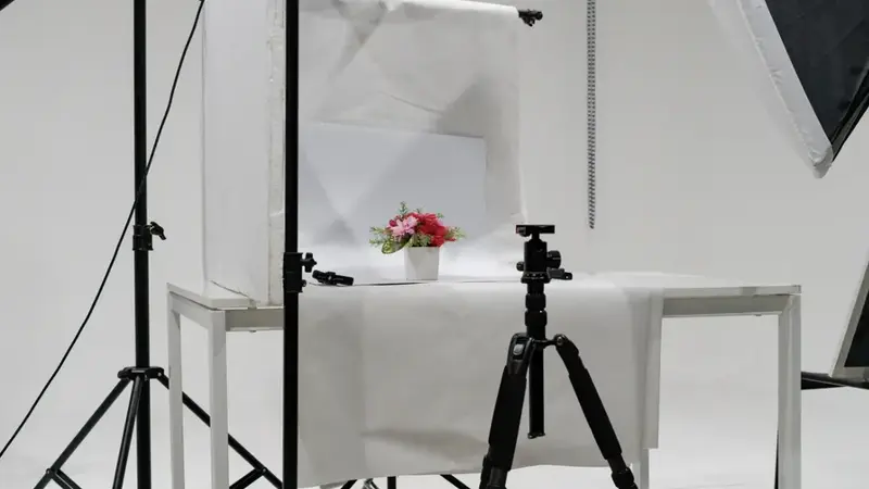
Use a tripod for sharpness and consistency
Keep framing consistent across products
Shoot slightly above or at product level for flattering angles
Take more shots than you think you need and select only the strongest
After shooting:
Maintain consistent cropping ratios
Export at web-optimized sizes for fast load speed
Use consistent file naming and alt text for SEO and accessibility
Premium isn’t only what the product looks like. It’s what the brand feels like when everything is done with care.
Create a Repeatable “Premium System”
The easiest way to maintain premium visuals across your store is to build a repeatable system. When you can create great photos on demand, your product pages stay cohesive as you add new inventory.
Your premium system might include:
One primary lighting setup (window + reflector or softbox)
Two to three background surfaces
A shot list for every product
An editing recipe
A consistent cropping and export standard
This reduces decision fatigue and keeps quality high. It also makes your brand look stable, which is a premium signal all by itself.
Premium Photography Is Really Premium Communication
Making ecommerce products look more premium isn’t about tricking anyone. It’s about communicating quality clearly.
Better light makes your product feel tangible.
Clean backgrounds make your brand feel intentional.
Consistent angles make shopping feel easy.
Honest edits make customers trust what they see.
Thoughtful details make your business feel professional.
When your photography communicates care, customers assume your product was made with care too. That assumption is the bridge between “interesting” and “I’m buying this.”
Premium photography doesn’t just make products look better. It makes the purchase decision feel safer. And safe, confident decisions are the ones that convert.